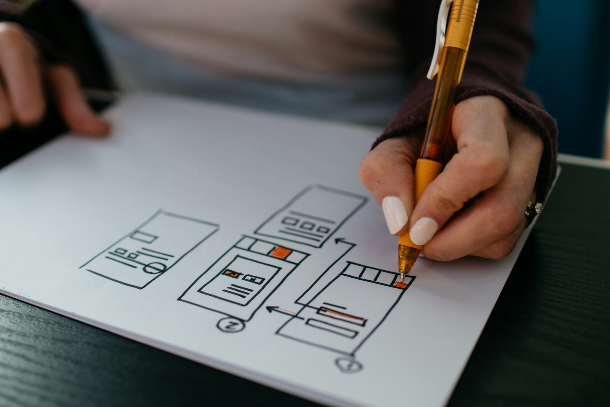
Every design is made up from a series of elements. These can be colour, shape, typeface and imagery. Now comes the tricky part: assembling these elements into one, coherent whole. The act of bringing together the elements to form a single web page, poster or advert is called “composition”, and it’s something that every new designer needs to learn how to do.
In this article, we look at the principles behind graphic design composition. What do we need to bear in mind when we’re creating our finished piece?
What is composition in graphic design?
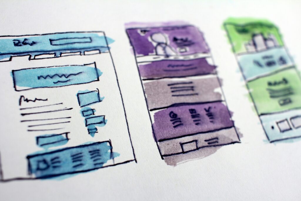
Graphic design is made up from different elements, and composition is how we bring these together as a whole. When we compose our design, we’re making sure that the shapes, colours, shading, texts and images all integrate to create a pleasing and seamless single piece.
What’s the difference between layout and composition?
The terms layout and composition seem pretty interchangeable but actually there’s a subtle difference. A graphic design layout is more about what goes where, and can apply to anything from kitchen units to a newspaper page. Composition is more creative. It’s not simply organising the elements in a given space: it’s about making sure they work together to create a harmonious whole.
When you’re pulling together the complete work, there are several principles to design composition to take into consideration, and we’ll take a closer look at these now.
The principles of composition in design
In graphic design, every good composition should have a visually appealing composition that attracts attention and then conveys the message. To achieve this, there’s a series of helpful principles to follow, which guide you towards pulling together the perfect composition.
- Scale
As designer Paula Scher says, “Scale is important in every aspect of design”. You can use scale to draw attention to certain elements of the design: as we’ll naturally spot a bigger shape first, go large with your logo or key message. What’s the most important element in this composition?
- Hierarchy
We’ve just looked at how scale can be used to create hierarchy – in other words, to signal what’s the most important element of the composition. We can also use colour and shade to demonstrate hierarchy, along with whereabouts on the layout an element sits. Place the most important elements where people naturally look first (more about this in a moment).
- Contrast
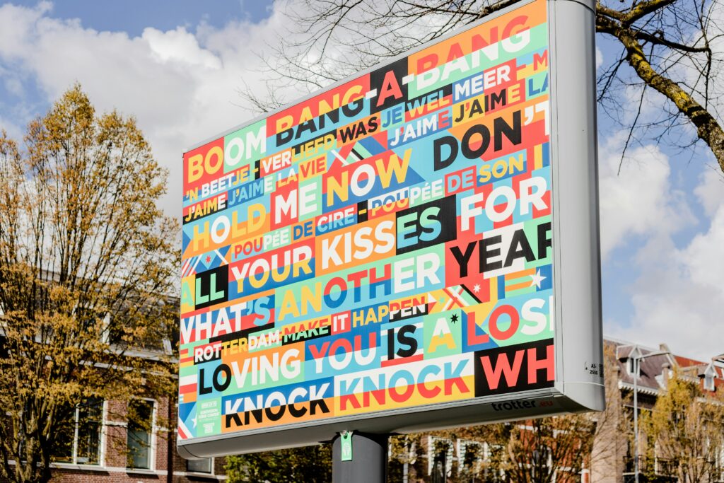
Create contrast in your design to make it more eye-catching. This can be light and dark, contrasting colours, different line thicknesses, text verses images. Contrast is another great way to highlight the most important graphic design components.
- Negative Space
Don’t exhaust your audience with a dense, overfull composition. Give the elements room to breathe by leaving some negative space (sometimes also called “white space” or “blank space”). As well as being more aesthetically pleasing, negative space acts as the background for the most important elements such as logos and text.
- Direction

People tend to look at a graphic in the same way as they read a book, which is from the top down and from left to right in Western culture. Place the elements – and this can also apply to text – that you want to emphasise the most at the top and to the left, which again, is a clear way to create a hierarchy.
- Repetition
Repeating a design or colour can look great and helps to tie your composition together. You can group together elements by colour to create associations and hierarchies (everything that’s written in red needs the most attention, for example). Repetition also helps to create brand consistency, such as across different web pages.
- Balance

How are you going to create balance within your design? Will you use symmetry to create a classic and easy-to-read effect, or play with hierarchies by having an asymmetrical composition? Asymmetry isn’t a random design; rather it achieves balance by using different elements such as colour, scale and contrast.
Pulling everything together
It’s all very well knowing the principles of composition – how do we apply these in practice? It can really help to use a grid to help you pull all these elements together.
With a grid, it’s easier to make decisions such as whether a rule of thirds or a golden ratio composition will work the best. It will help you make sure that you’ve established a hierarchy for your elements, as well as checking that the composition principles are in place.
Soon, you’ll be using these 7 principles of graphic design composition without even thinking about it. For now, keep them as a handy checklist for when you’re bringing the design elements together.
Do you want to learn more about the aspects of good graphic design, and how you can use design elements to create the perfect composition? Take a look at designer Paula Scher’s BBC Maestro course, Graphic Design. Paula explores the role that graphic design plays in marketing and branding, and how design can be used to communicate, with and without words.


