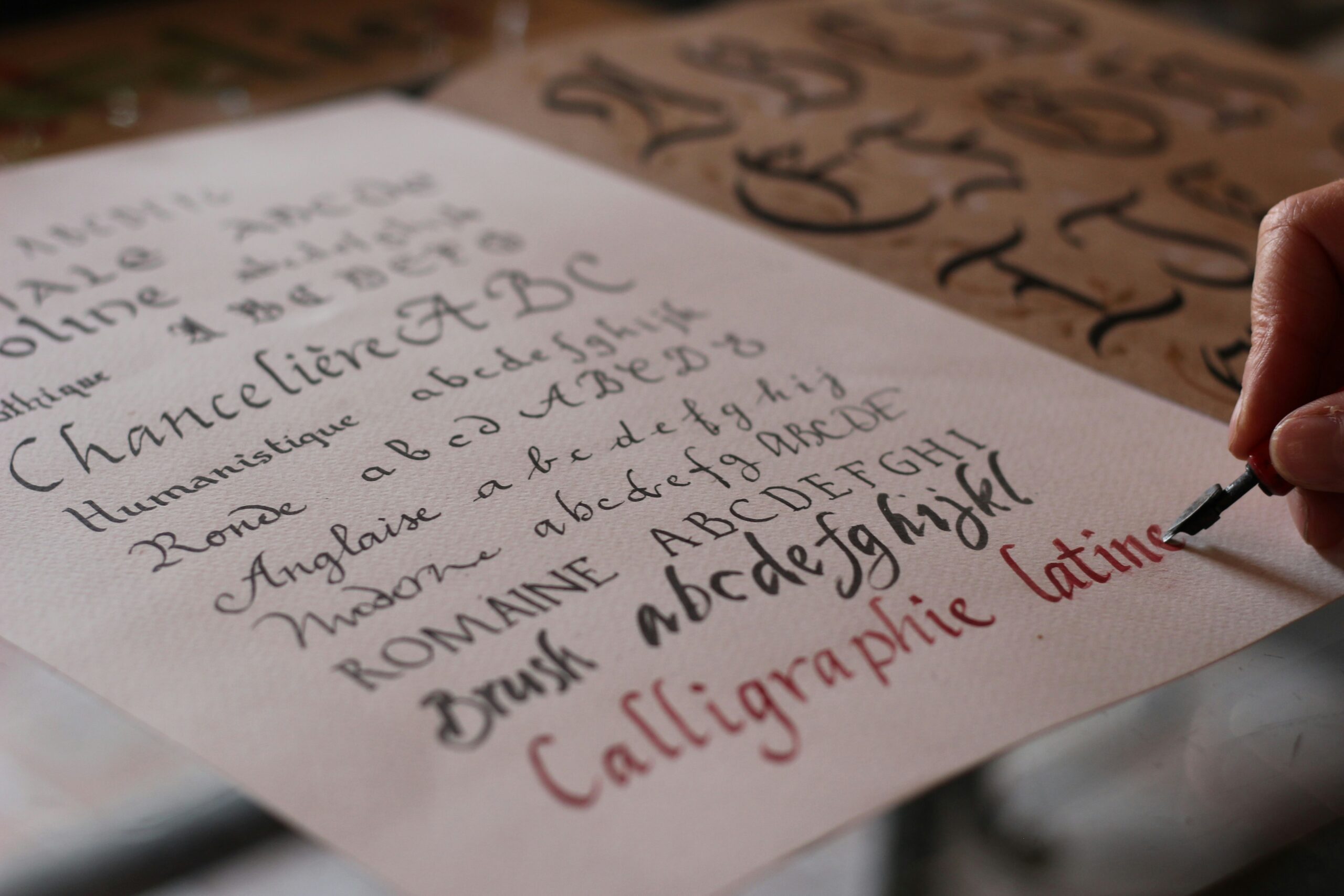
What is lettering? It’s the art of drawing letters, rather than simply writing them. While true lettering is typically hand-drawn, it’s often replicated in type, giving us typefaces like Lucida Calligraphy, Brush script and Baguet Script.
Different types of lettering are often used for smaller sections of text such as slogans, headers and logos: lettering looks beautiful, but you wouldn’t want to read reams of it!
In this article, we’ll take a look at seven inspiring letter styles. All have their personalities and can be used to create different design effects.
Why use different lettering designs?
Lettering in graphic design is as much a part of the look and feel of a brand or piece of work as the colours and images. Renowned graphic designer Paula Scher discusses the significance of choosing the right typography:
“What you see in typography is nuance and form and spirit. Words have meaning, type has spirit and when you put them together the combination is spectacular.”
Whether you’re using a handwritten typeface or painstakingly penning your own words, lettering is an excellent way to introduce extra character and individuality to your work. Combine elaborate styles with simpler fonts to maintain legibility, but definitely have fun with your headlines and slogans.
7 different ways to write letters
There are lots of different types of writing fonts, inspired by a range of styles as varied as graffiti and gothic. We’ve collected a few of our favourite examples here.
Block
Did you doodle on your school books or pencil case (it’s OK, we won’t tell)? If you did, you’ve probably been using block lettering for years. It’s typically heavy and sans serif, and sometimes has a 3D finish. The beauty of block lettering is that it’s super-easy to create your own alphabet and then digitise it, giving you a characterful – but very importantly, clear – typeface. It’s a great choice for slogans and signage.
Brush
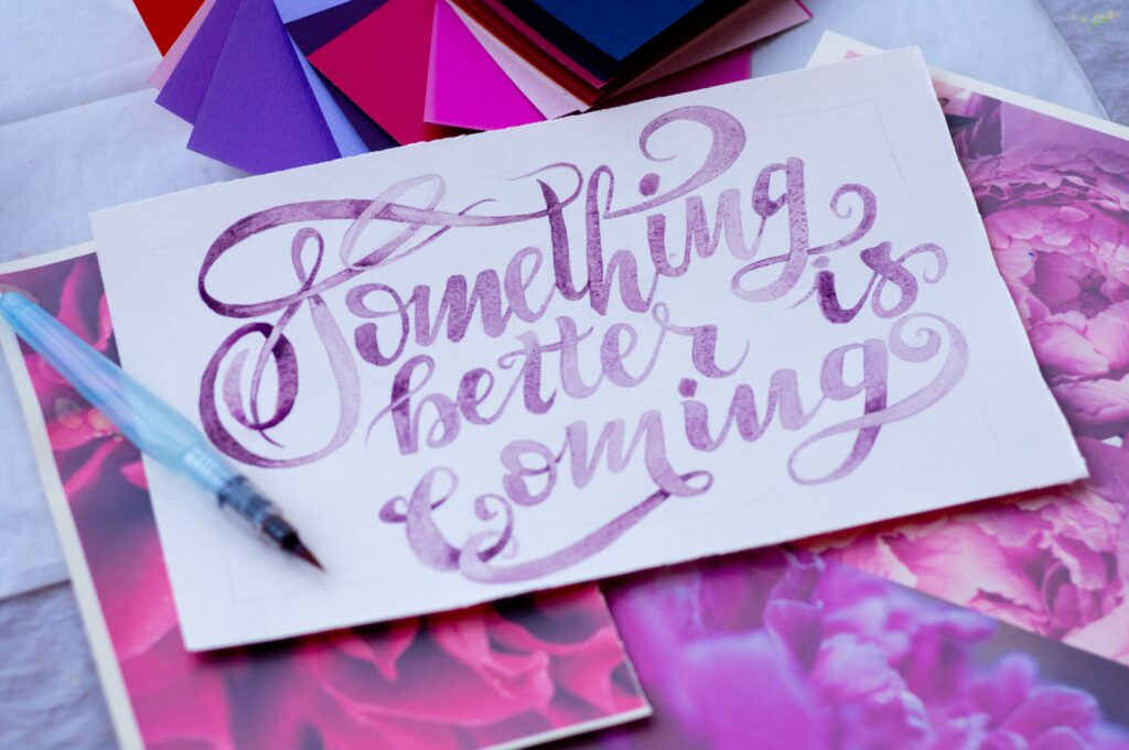
Hand-drawn brush blends informality with prettiness – it’s not surprising that it’s such a popular current choice for greetings cards and motivational quotes. It takes elements from traditional calligraphy such as thick downstrokes and lighter upstrokes, but the lines are looser and have gaps that show that it’s been drawn with a brush. You can use a brush typeface, but if you’re good with a paintbrush, you can create gorgeous lettering yourself.
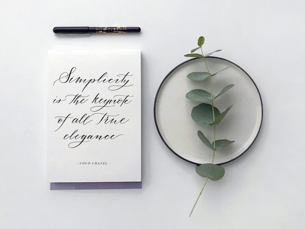
Script
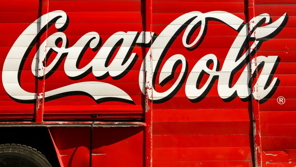
Like Brush, Script lettering is also inspired by calligraphy, and typically has flowing cursive letters. One of the most famous examples of script lettering in the world is the Coca Cola logo, which has barely changed since 1887. (Font nerd fact: the Coca Cola typeface is called Spencerian script, and it was designed by book keeper Frank Robinson, based on a Federal Bureau typeface.) Script is used to convey elegance and tradition, and its similarity to traditional cursive handwriting makes it a popular choice if you want something to look more personal.
Serif
“We come across the terms “serif” and “sans serif” a lot in the study of type. Graphic designer Paula Scher explains the difference:
“Serif looks like it has tiny feet and is more classical. Sans Serif doesn’t have feet and feels more modern. The word ‘serif’ refers to those tiny feet, and ‘sans serif’ means without those little feet.”
Times New Roman, created for the British newspaper, is one of the most famous serif typefaces. The New York Times moved from Times New Roman to Georgia, because its letters are slightly wider and easier to read. Use a serif font when you want to look authoritative or traditional, and add a bit of heft to your content. You can also hand-draw serif letters to add a dash of personality (tip: use a grid to get those little feet in place).
Sans serif
Without those little feet, a sans serif font like Arial is clean and easy to read. These are great typefaces to read on a screen, so a lot of online content uses sans serif letters. You can also pair sans serifs fonts with more elaborate type for a great effect – so, use a more handwritten style for the title or header, then switch to Helvetica for legible body copy. You can also hand-draw sans serif letters, which creates a look that’s both clear and informal.
Gothic
If you want to bring the drama, go gothic. This eye-catching lettering is based on medieval script so looks fabulous but isn’t easy to read. Use it sparingly for slogans and headlines, followed by a complementary sans serif typeface. If you love trying your hand at calligraphy, this is a very rewarding style to learn. Ask a tattoo artist.
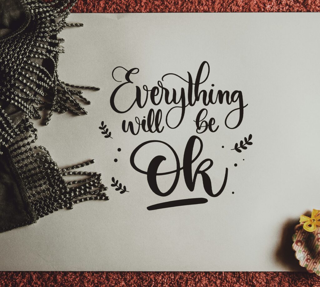
Modern calligraphy
Like brush, modern calligraphy is beloved of motivational quotes writers; however, don’t dismiss it as a passing fashion because it can be beautifully graceful. Modern calligraphy needs a pointed pen rather than a blunt traditional calligraphy pen, and you can use this to create that lovely fluid script (you can add your own characterful flourishes). Don’t worry if you’re not a calligrapher – you can download plenty of slim and cursive typefaces that recreate this elegant feel.
Those are just seven of the different lettering styles you can try. Adding just a dash of handwritten lettering, whether drawn or downloaded, can really transform the look of a webpage or printed design. Have fun exploring a range of handwritten styles, and remember…
If you want to know more about lettering and using type in general, check out graphic designer Paula Scher’s BBC Maestro course, Graphic Design. Paula takes an in-depth look into type and the impact it has on design.


